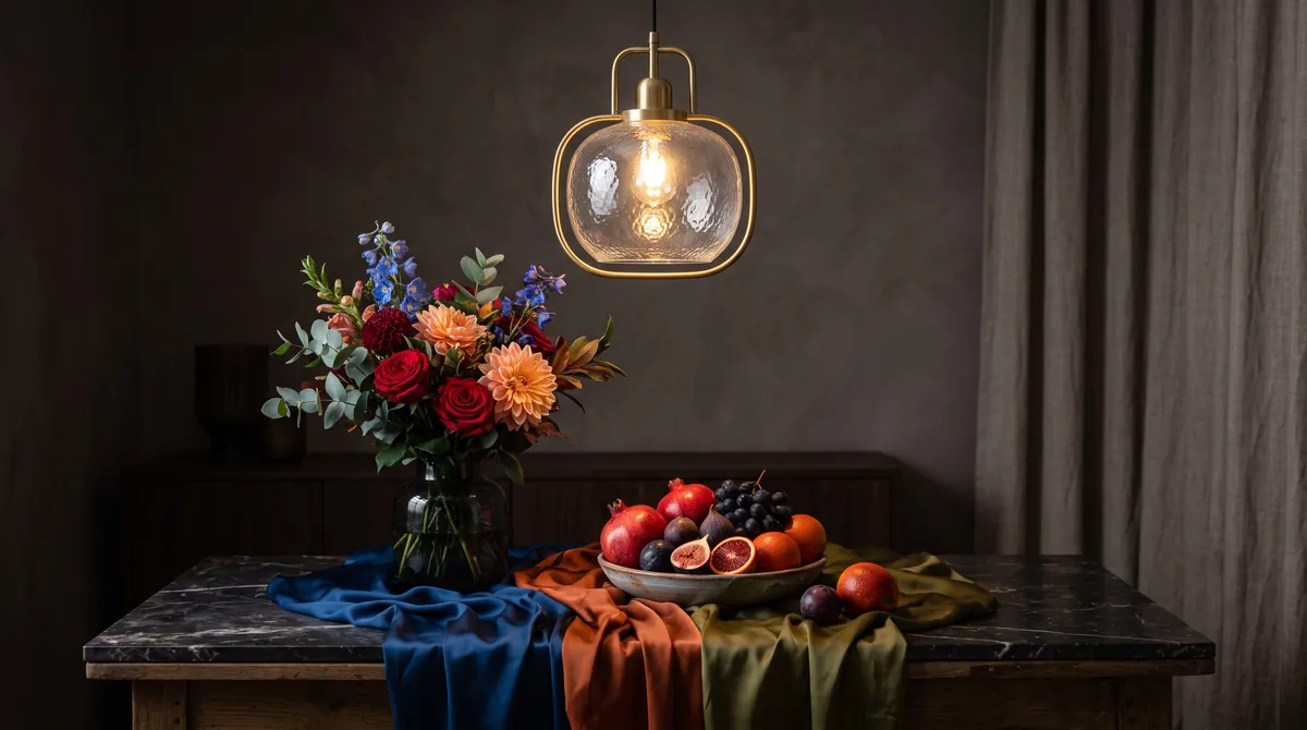

Colour rendering: why CRI matters for beautiful light
Two lamps can share the same brightness and warmth, yet make a ripe tomato, a velvet sofa or your own face look completely different. The reason is colour rendering.
Hold a ripe peach under a good lamp and it glows with blush and gold. Under a poor one the same fruit looks dull and faintly grey, although the light seems just as bright and just as warm. The difference lies in colour rendering: how faithfully a light source reveals the true colours of the things it falls on.
What CRI measures
The , written CRI or Ra, compares a lamp with a reference light of the same colour temperature. For warm light that reference is an ideal glowing body, much like a classic incandescent bulb; for cooler light it is a defined form of daylight. A set of test colours is lit by both, and the closer the lamp matches the reference, the higher its score.
The scale tops out at 100, which means colours look the same as under the reference. Incandescent and halogen bulbs reach 100 almost by definition, because they glow just like the reference itself. LEDs and fluorescent lamps build white light from a mixture of colours and can fall well short. Some light sources score very low or even below zero, such as the orange low-pressure sodium street lamps of the past.
Ra is the average of eight fairly pastel test colours, labelled R1 to R8. That detail matters, because an average can hide weaknesses, especially in the deep reds that Ra does not include.
Why CRI 90 and above matters at home
At home we look closely at the things we care about: food, skin, wood, fabrics and art. A difference of ten points on the scale is easy to see in these materials, even if you could not name what is wrong. Many ordinary household LEDs sit around CRI 80, which is acceptable in a corridor but often flattens warm materials.
| CRI (Ra) | Quality | Where it works |
|---|---|---|
| Below 80 | Poor for homes, colours look dull or shifted | Security lighting, technical spaces |
| 80 to 89 | Standard, the common household level | Hallways, storage rooms, garages |
| 90 to 94 | Very good, natural skin and food | Living rooms, kitchens, bathrooms, bedrooms |
| 95 and above | Excellent, close to incandescent | Art, dressing areas, colour-critical work |
Check the R9 value as well: a high Ra with a low R9 can still make reds look muddy.
R9: the red that Ra forgets
Beyond the eight standard colours, the method defines further test colours, to R15. The most important for interiors is R9, a saturated red. Red tones are everywhere in a home: in skin and lips, in tomatoes and wine, in terracotta, cherry wood, leather and many rugs. White LEDs have traditionally struggled with deep red, because the that turns blue LED light into white emits relatively little of it.
A lamp with Ra 90 and a weak R9 may still make a red sofa look brownish. Lighting specialists commonly regard an R9 above 50 as good and above 90 as excellent. Better manufacturers publish R9 on the data sheet; if a product keeps it quiet, assume the figure is not impressive.
How to read the packaging
In the EU, the packaging must state the light output in lumens, and colour temperature and colour rendering are normally shown as well, usually as “Ra” or “CRI”. A three-digit code is also common, especially on tubes and professional lamps. It combines both values in a compact form.
- 927: the first digit stands for colour rendering of 90 or more, the last two for 2,700 K.
- 830: colour rendering of 80 or more at 3,000 K, the common standard.
- 940: colour rendering of 90 or more at 4,000 K, neutral white.
- R9: usually listed only on the technical data sheet, but worth looking up.
- “Full spectrum” or “daylight quality”: marketing terms without a fixed meaning, so look for the figures instead.
Professional lighting designers increasingly use a newer method called , developed in North America, which evaluates 99 colour samples and reports both fidelity and saturation. You will rarely find it on a household box, but it is a good sign when a manufacturer publishes it.
Food, skin, art and textiles
Kitchens and dining tables benefit most visibly from high colour rendering. Fresh herbs look green rather than olive, bread looks golden, and a roast looks appetising rather than grey. Above a dining table, CRI 90 with a strong R9 is worth more than extra brightness.
Bathrooms and dressing areas need truthful light on skin. Low colour rendering makes complexions look sallow and make-up hard to judge. Combine CRI 90 or higher with warm white of around 3,000 K, and light the face from the front rather than only from above.
For paintings, rugs and textiles, colour rendering decides whether you see what the artist or weaver intended. Pigments, natural dyes and silk carry subtle shifts of hue that basic LEDs simply flatten. A picture light of CRI 95 or more is a sensible choice for a cherished canvas, and good LEDs add the bonus of very little ultraviolet in the beam.
An average can hide weaknesses, especially in the deep reds.
Beyond the number
CRI is a helpful filter, not the whole story. Two lamps with the same score can still differ in tint, consistency and flicker, and high colour rendering costs a little efficiency, because producing more red light takes extra energy. Buy lamps for one room from the same product line, check that the colour temperature matches, and trust your eyes under the real conditions of the room.
glaminia is independent and does not sell lamps or recommend dealers. Images are AI generated illustrations, not photographs of specific products. Have fixed electrical work done by a qualified electrician.


